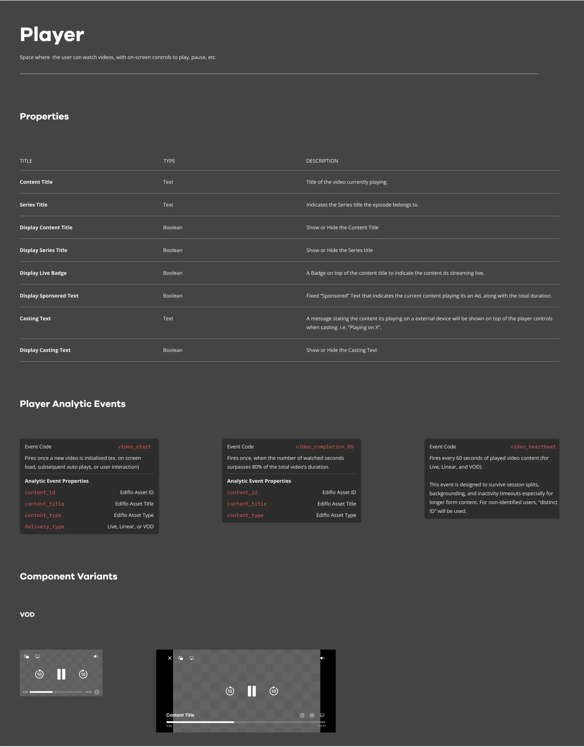
A streaming design system across iOS, Android, and Web. Built to be AI-ready from the ground up.
- Senior Product Designer
Tools
- Figma
- Cursor
- Claude
- Auth0
- Vercel
Team
1 Design Director
1 Senior Product Designer
1 iOS Lead Developer
1 Android Lead Developer
Timeframe
~6 months
November 2025 – Present
Structure
A component system across iOS, Android, and web that unifies and simplifies streaming products with space for their own identity.
Scope
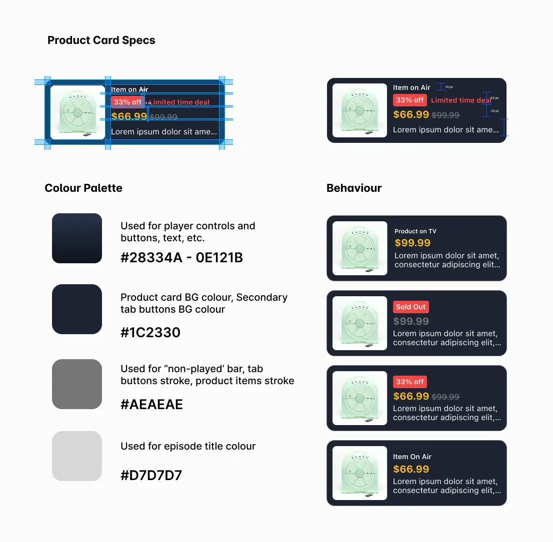
Card ratios, grids, headers, tabs, buttons, icons, chips, input fields, players, checkboxes, prompts, badges. Fonts, colours, and spacing are defined per platform and client.
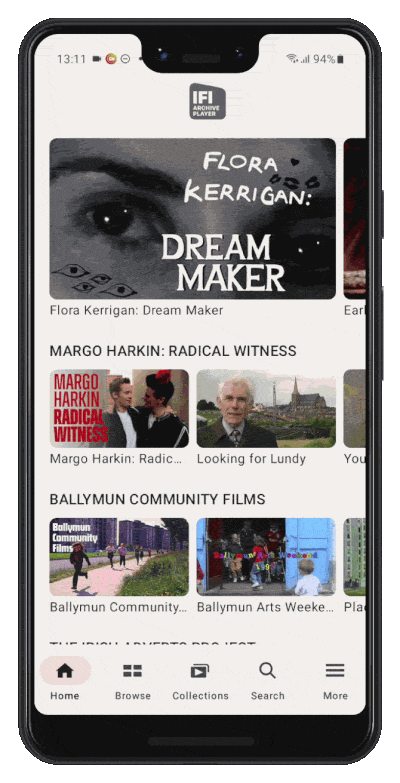
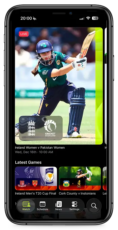
Live Products
Irish Film Institute and Cricket on iOS and Android, and Pac 12 on web. Being a key front-end developer on this last one, using Cursor, Auth0, and Vercel, with the Figma system connected directly via MCP.
Introduction
I came into this project as the designer and left it shipping production code. Core is a streaming design system across iOS, Android, and web: one structural layer under three different clients with genuinely different content types.
I co-designed the architecture and wrote every component description to be machine-readable, which is what made it possible to connect Figma directly to Cursor and ship the Pac-12 web implementation without a dedicated frontend developer.
Why we needed a System
Before the current system existed, each streaming app was being designed in isolation. Card ratios differed between platforms. Button behaviour was inconsistent. Movies & Series screens were rebuilt from scratch for every new client based on their preferences and goals. This led to numerous reworks and versions in separate files and components that worked similarly, with tens of components per file.
The result was predictable: decisions made for one product didn’t carry over, onboarding a new client meant starting from zero, and the gap between what was designed and what got built widened with every handoff, sometimes even between platforms.
Three platforms, three conversations
Each platform brought a different engineering conversation.
On Android, the lead developer shaped how we defined colour roles for Light and Dark modes, and guided how complex components needed to adapt for Android’s Adaptive layout. That was a genuine collaboration, landing on the token structure that reflected his input as much as mine.
iOS was harder. Apple’s liquid glass UI forced us to revisit most of the system to stay aligned with the new design language, which meant decisions we’d already made needed revisiting. On top of that, changes to the card corner radius and how badges or content info should be rendered (baked-in on the image or as a separate component overlaying the card) made us make various exceptions for iOS. Those changes sit at the intersection of brand identity and platform convention, so there was no clean default answer.
Web had the widest surface area. We adapted Tailwind’s structure and customised it to sit closer to what the other systems already looked like, but web introduced constraints iOS and Android don’t have: shelf behaviour across breakpoints, fluid font sizing, accessibility requirements, and more layout edge cases than native mobile platforms. It took longer to feel stable, but the result is also the most thoroughly documented of the three.
Where it got interesting
A Shared structure and separate identity, explicitly scoped.
The temptation with a multi-platform system is to unify everything. We didn’t. Things like corner radius, spacing and some effects (like shadows) are intentionally separate per platform, while fonts and colours are set by client. What the system owns is layout logic: card ratios, grid structure, component properties. That boundary made the system useful without making every app look the same. Clients could see their product in it, not a generic shell.
Solved problems belong to the library, difficult solutions that need to be contrasted belong to the customer.
Cards and buttons are solved problems. A schedule view that works for a live cricket match, a map locator for old Irish reel shorts, and a college sports Game center is not. The latest ones belong to each project file. Special components like Time display formats and live state indicators varied enough from any default component that they deserved a separate space on each client project, considering adding those to the main libraries if more clients demand the same component as well.
A Future-proof system
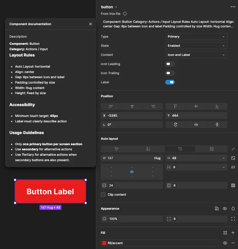
Component descriptions were also written to be machine-readable for the web, with consistent naming, complete variable definitions, and descriptions precise enough for a model to act on. It added rigour that the system would have benefited from anyway.
Connecting Figma with AIs
With all components structured around variables, I connected the Figma system to Cursor via an unofficial plugin called Figma-Console-MCP. The Pac-12 web implementation became the live test case.
That meant establishing Figma variables for spacing, colour, typography, and corner radius, and writing component descriptions precise enough to be consumed programmatically. Using the Figma MCP with Claude cut what would otherwise have been intensive manual work considerably. A round of manual polish on the code output closed the remaining gaps between what the agent generated and the production-ready version.
In practice, it changed the handoff. Working in Cursor meant that we could pull token values, component specs, and layout constraints directly from the Figma file without leaving the editor. Any token change in Figma surfaced almost immediately on the branch we were working on.
One broader implication we’re still working through: because the system is now fully connected through MCP, the entire design system can live in code. That opens the door to flipping the source of truth from Figma to Cursor entirely, a shift we’re actively exploring.
Example of Claude creating new variables in Figma, and pulling those into Cursor using MCP connections.
PAC-12: from designs to shipped product
PAC-12 was the most complete test of what the system could enable. A college sports streaming platform on web, built with the Core design system applied end to end.
The MCP connection also changed my own role on the PAC-12 project. I became one of the main developers on the web implementation. Designing in Figma, building in Cursor, connecting Auth0 for user auth, and using GitHub and Vercel to deploy and publish across branches. For a solo designer, that’s a scope that wouldn’t have been realistic otherwise.
The system made design decisions machine-readable. What in the past would normally require a dedicated frontend developer to bring it to life, a designer can now own the whole product extension, from discovery to production code.
Where it runs today
The Irish Film Institute and Cricket implementations on iOS and Android were the first proof that the structural layer held across genuinely different content types. A film archive and a live sports product share almost nothing editorially. But the same card grid, schedule screen logic, and header behaviour worked for both. What changed was surface: typeface, colour, density. The skeleton stayed the same.
A year ago, the same Cricket app could have taken 6 months to make from scratch. Having that design system in Figma and replicating it in Swift made it possible for us to have it in 2 months.
How it stays consistent
Updates follow a complexity threshold. Simple UI components like buttons and toggles can be added directly. Custom and niche components need to be contrasted with research data, documented trade-offs, and added to the customer’s file. Anything more structural needs agreement between the Design Director and the designated platform developer.
Components are also built with enough flexibility to absorb small surface decisions, like a tab switching from an underline to a pill shape, without touching the underlying structure. The review process works the same way: research and trade-offs are expected alongside any proposal. Opinion alone doesn’t move things forward.
Next Steps
MCP and AI workflow
- Expand the MCP connection to iOS and Android, not just web.
- Test AI-assisted component generation for new client onboarding (using Claude Design, Paper, etc.).
Governance
- Build a more formal contribution process as the number of platforms and clients grows.
- Create a shared changelog visible to both design and engineering across all platforms.
Adoption
- Onboard the next streaming client directly from the existing base, using Pac 12 as the template.