A B2B2C livestreaming platform with ecommerce at its core.
- Product Designer
Tools
- Figma
- Adobe Suite
- Miro
- Notion
- Webflow
Team
1 Product Owner
1 Product Designer
2 Developers
1 QA Engineer
Timeframe
~6 months
Aug 2021 – Feb 2022
Introduction
Storefront was a B2B2C video commerce platform designed to help media brands self-serve their own livestreaming shopping experiences. I joined Axonista as the sole Product Designer on a POC that had real potential, with the goal of turning it into a shippable product in under six months.
Below are all the steps that were involved in bringing this product to life.
Problem
Mastercard wanted to replicate the explosive success of livestream shopping in China in Western markets. The product had two distinct entry points (brands and consumers), which required both streaming knowledge and a strong understanding of e-commerce flows.
Solution
The solution had three layers: a stock-linking system (Shopify in this case) for brands, a digital production studio to run live shows, and a consumer-facing web app to watch and buy products in real time.
Target Customers
Storefront was built for established brands that already have an audience, ones with a story to tell and the content muscle to tell it, whether in-house or through an agency. The commercial angle mattered too: these were brands looking to close the gap between content and conversion, not just grow followers.

Impact
Shortly after the first real-world demo tests, Mastercard decided to freeze the project. Western markets proved slower to adopt livestream commerce than anticipated, infrastructure costs exceeded projections, and existing competitors were struggling to sustain themselves. Axonista followed Mastercard’s decision a few months later.
121
Components Designed
81
Screens Created
5
Competitors Analyzed
Problem
Back then, we saw a trend in China about video becoming the primary way the next generation wanted to shop, but most e-commerce companies were completely missing that. The real challenge wasn’t technical: it was about compressing the gap between a brand creating a moment and a customer acting on it. My goal was to redesign the shopping journey to feel shorter, more intuitive, and more human.
Shortening the path from “I want that” to “I bought that” was the whole point. To get there, Storefront had to give brands real tools: a way to reach customers directly, a format that converted, and a foothold in a market moving fast. Not just a feature set, a way to compete before the window closed.

Bambuser had been the go-to option for smaller brands wanting embeddable shows since 2019, retail-focused, practical, and broadly adopted. In the US, TalkShopLive was the most recognisable name in the space outside of TikTok: shoppable video that brands could embed on their own sites and push through social. Neither was without limitations, which is part of what made the opportunity interesting.
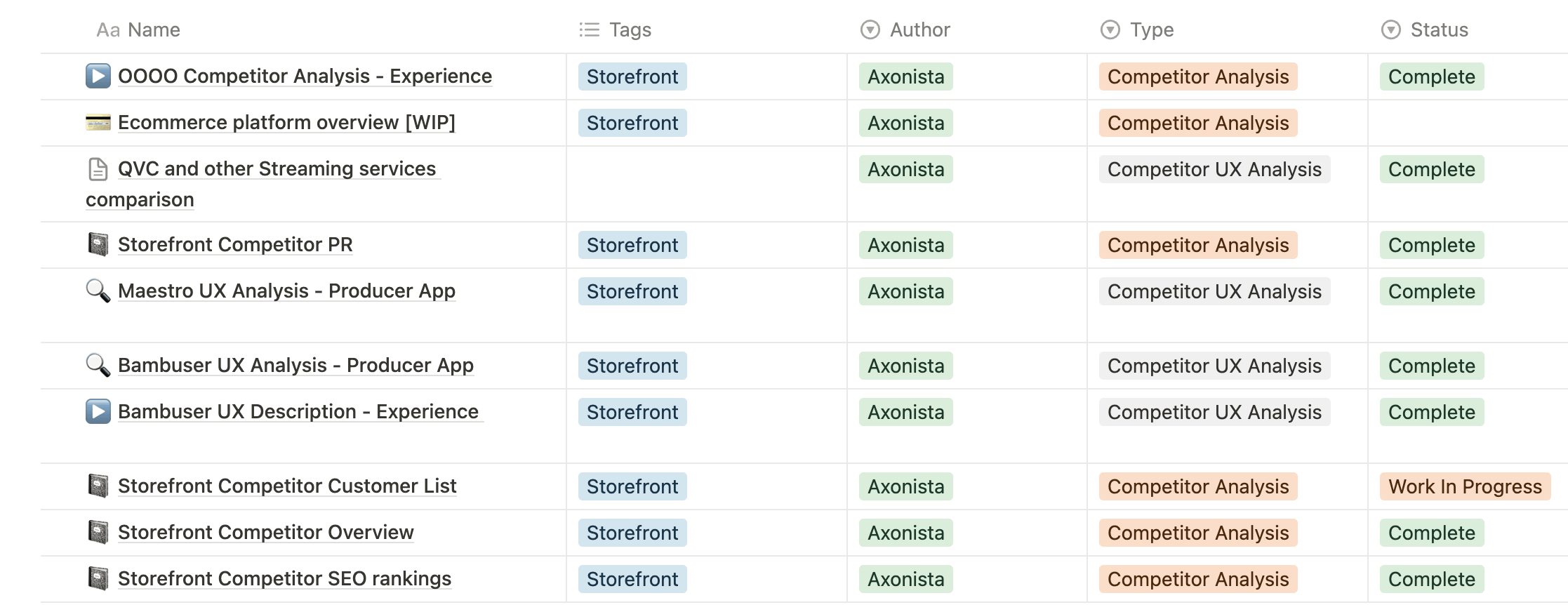
Desk Research
A UX competitor analysis on Bambuser, OOOOO and other main competitors was also done to detect in which areas our product must achieve the same level, and which areas we can actually improve.
This was also backed up by some data about the status of the livestreaming e-commerce industry and some desk research about the best Chinese livestream e-commerce companies.
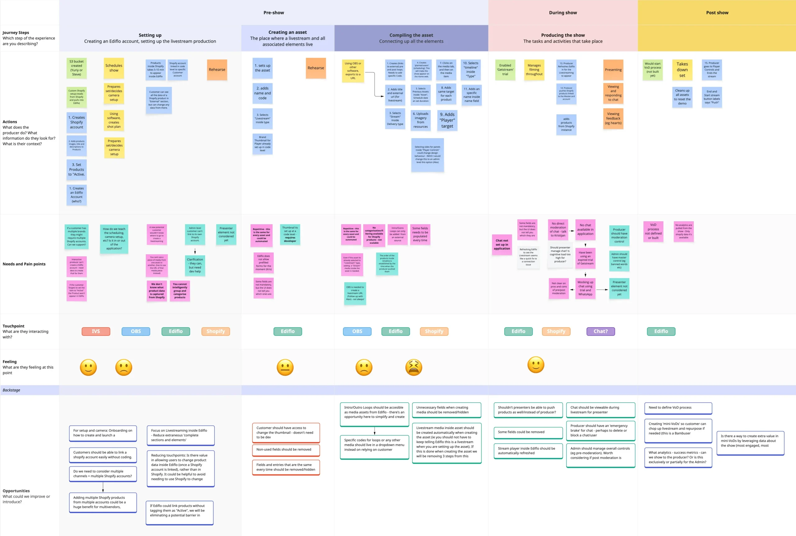
Customer journey
Focusing on what I discover while using competitors services, and some research around how they are set up to produce a show, I plan out a customer journey to organise the different stages and tasks a Producer/curator needs to perform before, during and after the show, to uncover opportunities based on their pains and needs.
The Approach
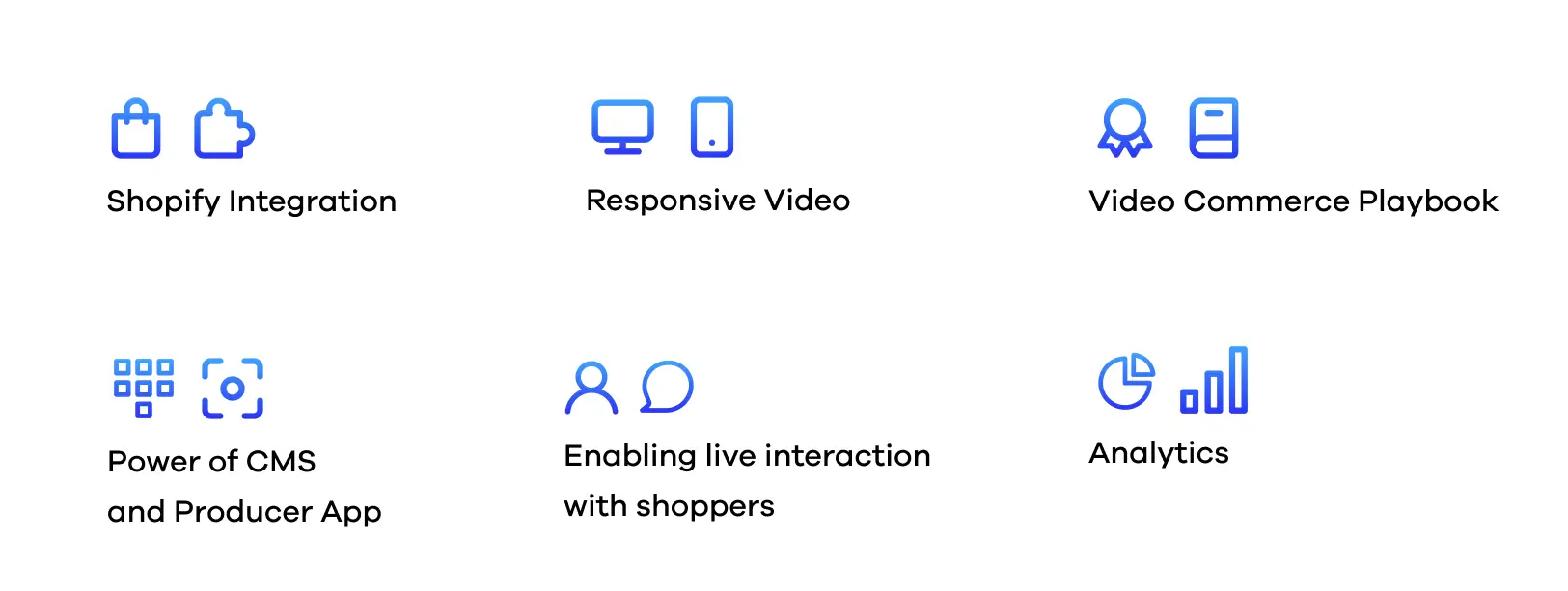
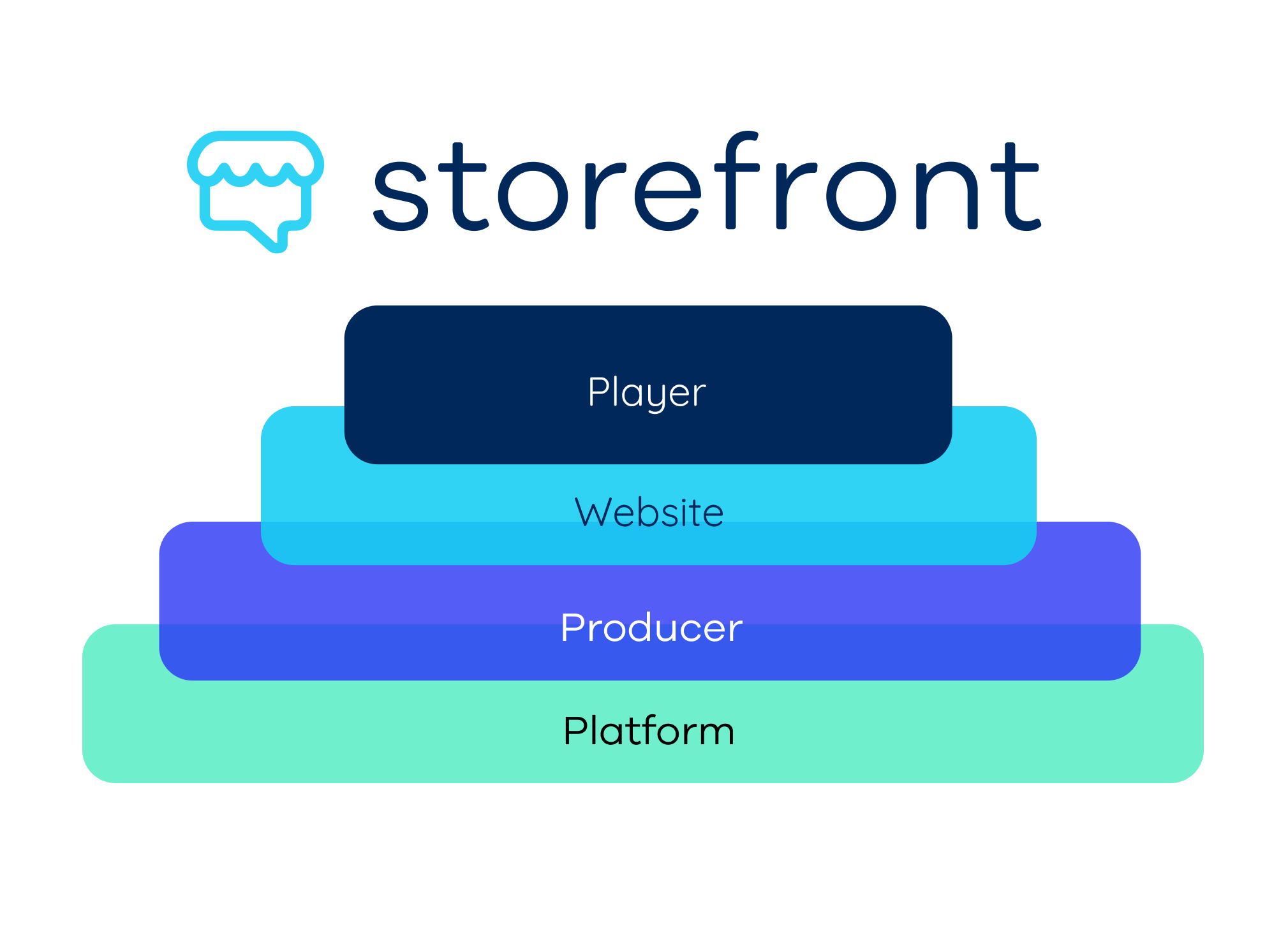
The product was designed around four core layers:
-
- Player: Where consumers watch, engage, and buy. Runs on a Storefront site or embeds directly into a brand’s own.
-
- Website: A branded home for all shows, channel management, accounts, and audience browsing in one place.
-
- Producer system: The backstage tool. Brands use it to set up shows, sync their e-commerce catalogue, push products during a live, moderate chat, and review performance after.
-
- Platform: The underlying engine powering integrations and advanced features. Mostly invisible, but it supports custom solutions for flagship clients.
Solution
Roadmap
From there, we mapped out a roadmap covering all stages and features needed to support demos and early pilots.
Wireframes
With the main screens mapped out, I moved into wireframes, prioritising the flows and features with the highest impact before touching the visual layer.
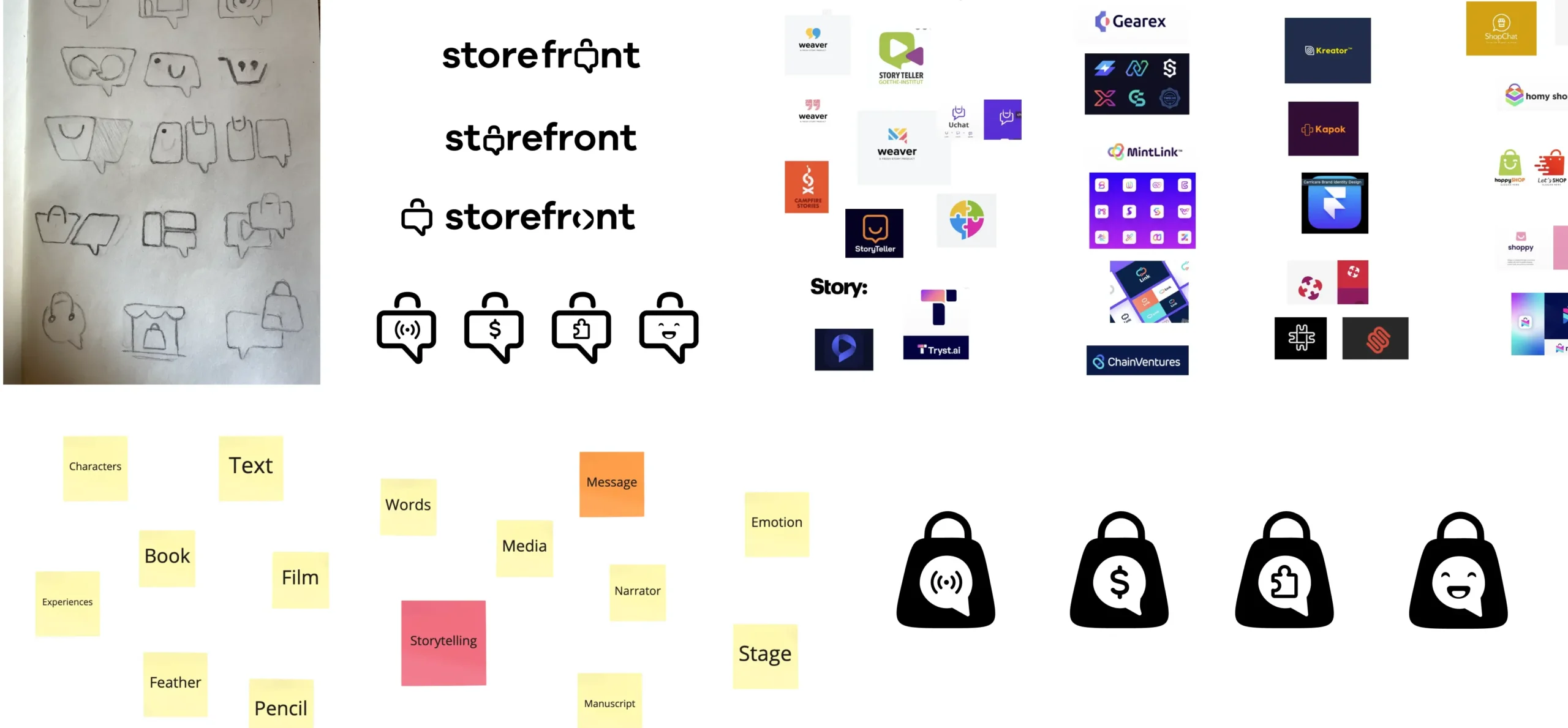
Branding Workshop
I ran a branding workshop with key stakeholders to align on direction, starting with a brand statement, then working through moodboards, mind maps, and a few rounds of iteration until we had a solid foundation to build from.
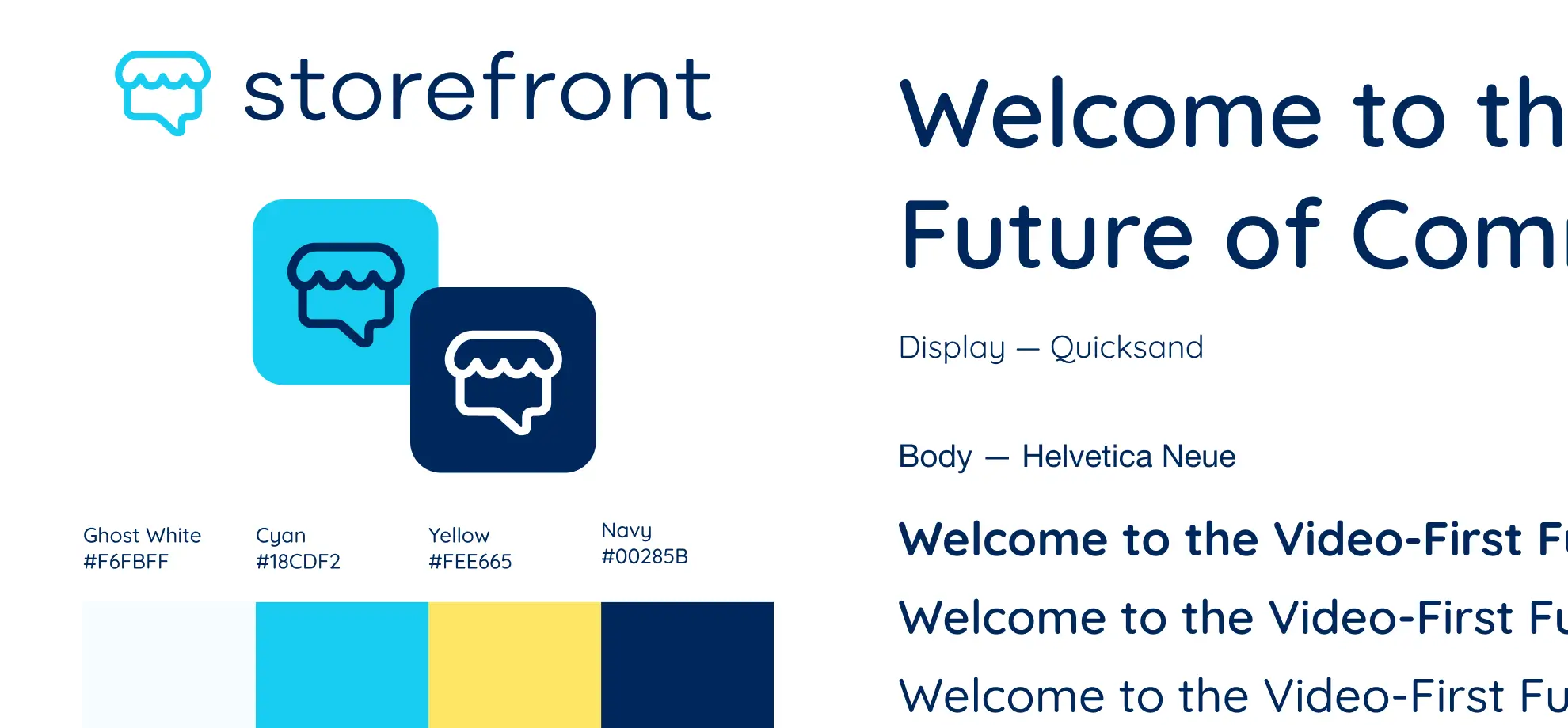
Brand and Logo
With the direction set, I built out the full brand system with dark and light variants, colour palette, typography (display and body, including weights), iconography, photography, and patterns.
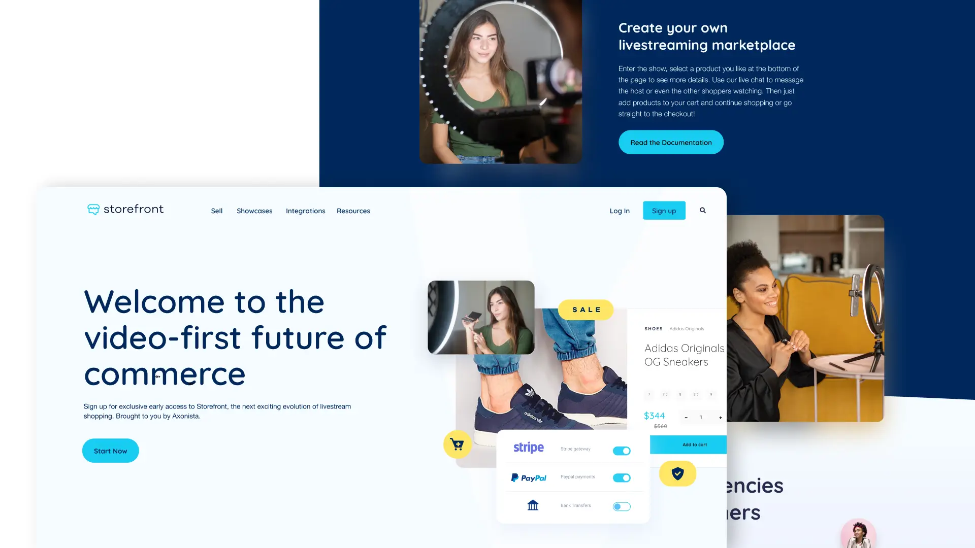
Landing Page
In parallel, I designed a landing page to build awareness and interest ahead of launch.
Prototype & Testing
With the MVP scope defined, I built a high-fidelity prototype in Framer and ran moderated usability tests (both remote and in-person) using UserInterviews and Lookback. These tests covered three core player areas: product purchase, chat, and social registration.
We also used the sessions to gather more intel on competitors like TalkShopLive, Amazon Live, and Bambuser.
Interview Insights
Testing revealed friction around product order, mute controls and finding size chart section. That said, all users moved through the show entry and purchase flow without major barriers, and the general reception was positive.
Iterations
Testing made it clear where the product was falling short. Several layout changes and new features were needed to help users browse products without breaking focus on the show.
- Changing the bag icon to a cart icon reduced ambiguity: in April, only 1 in 5 users identified it as the cart, which rose to 3 in 5 after the change.
- The product list went from confusing (3/5 in April) to well understood (5/5 in July) after replacing the shelf with a cleaner vertical panel.
- 5/5 users preferred “Add to cart” over “Checkout”, revealing a hierarchy mismatch where the less-used action was styled as the primary button.
- 5/5 users tried to mute by tapping the centre of the screen, matching established patterns from Instagram and TikTok, so the mute behaviour was updated to reflect that.
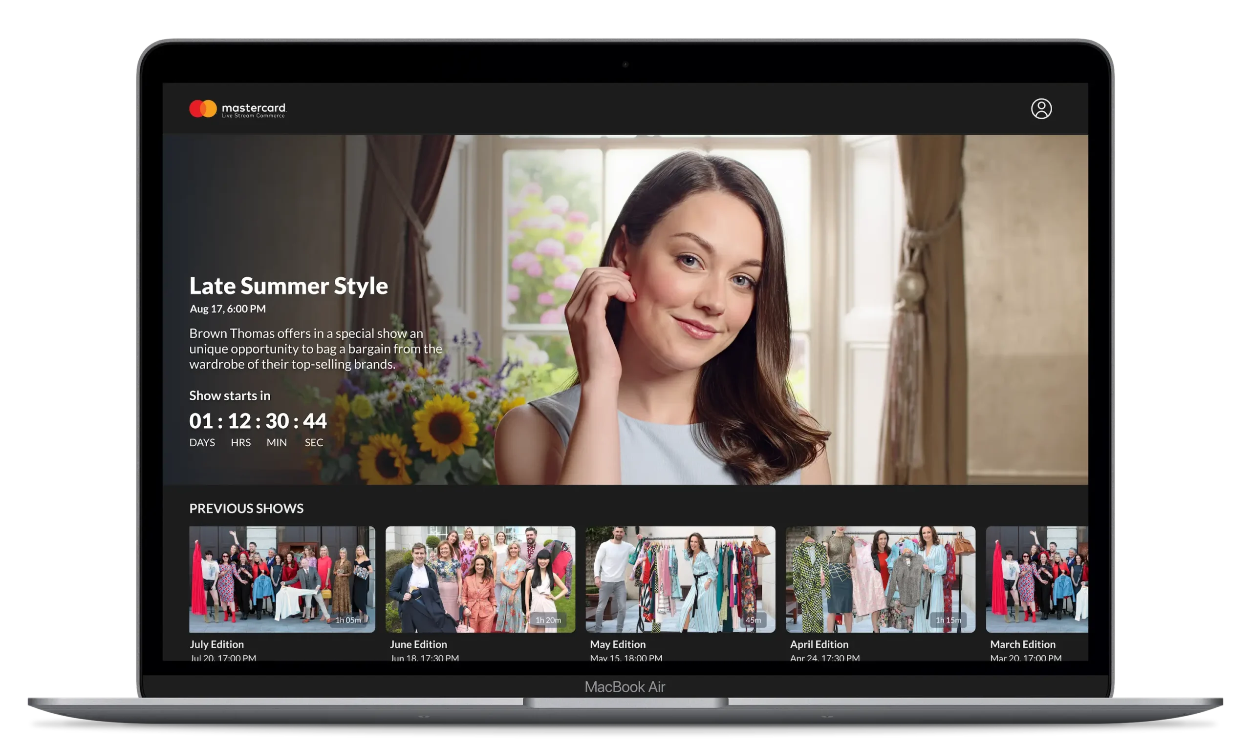
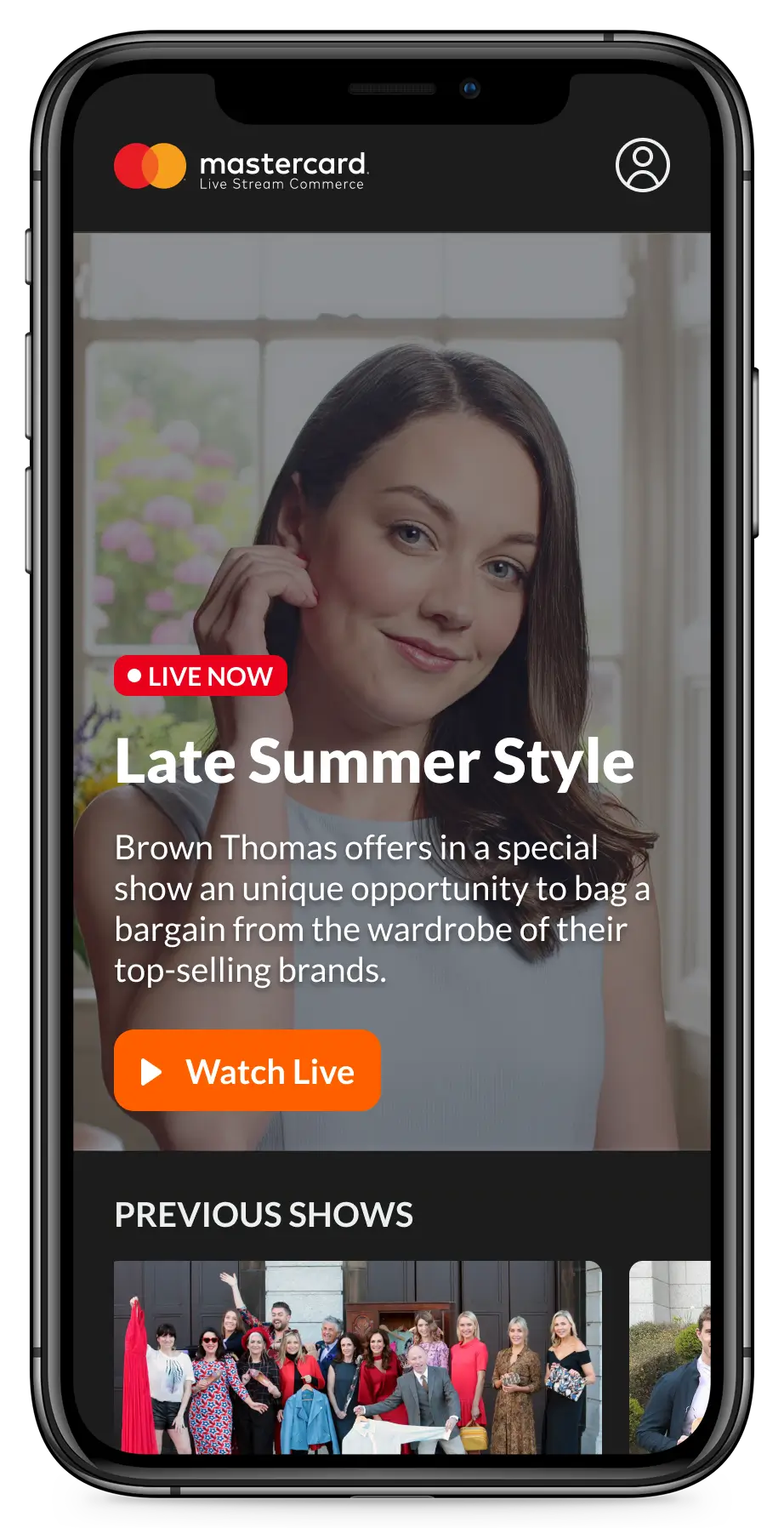
Home Page
Each brand gets its own space, with future iterations accounting for sub-brands too.
The header anchors the experience: a dynamic area that shows a countdown, a live badge, or a Watch button depending on whether a show is upcoming, live, or recently aired.
Below it, users can browse past shows and curated collections, search for specific content, or access their account.
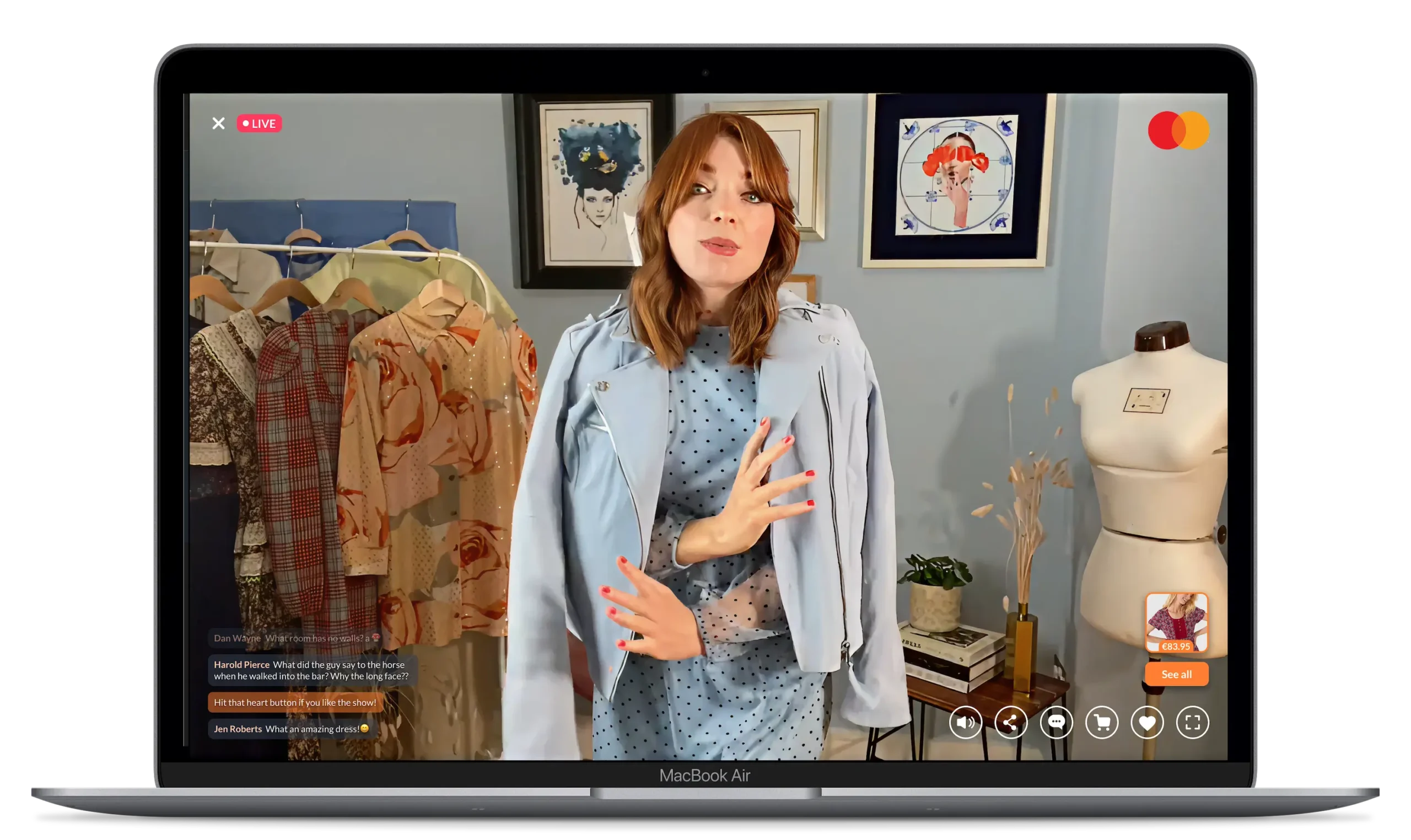
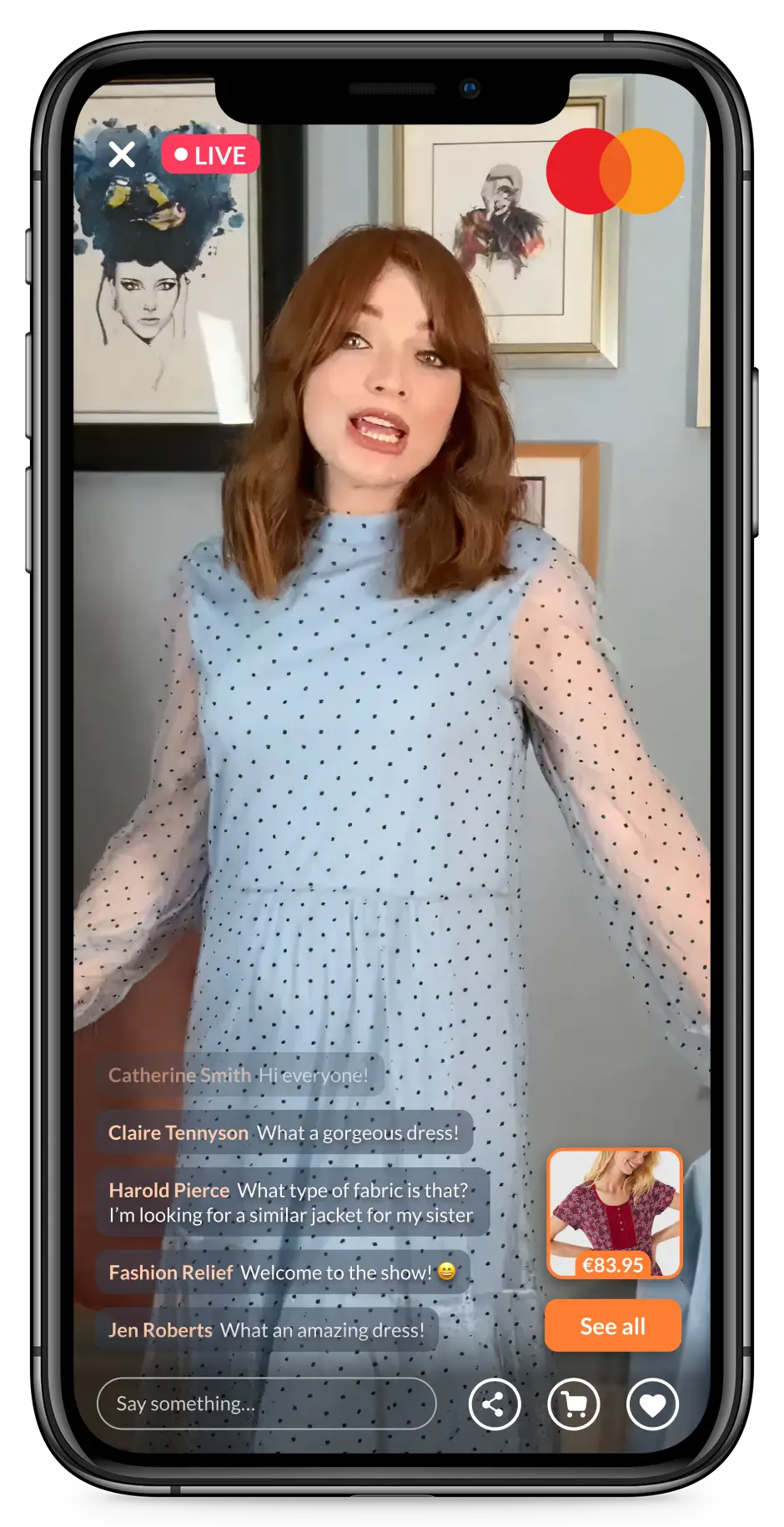
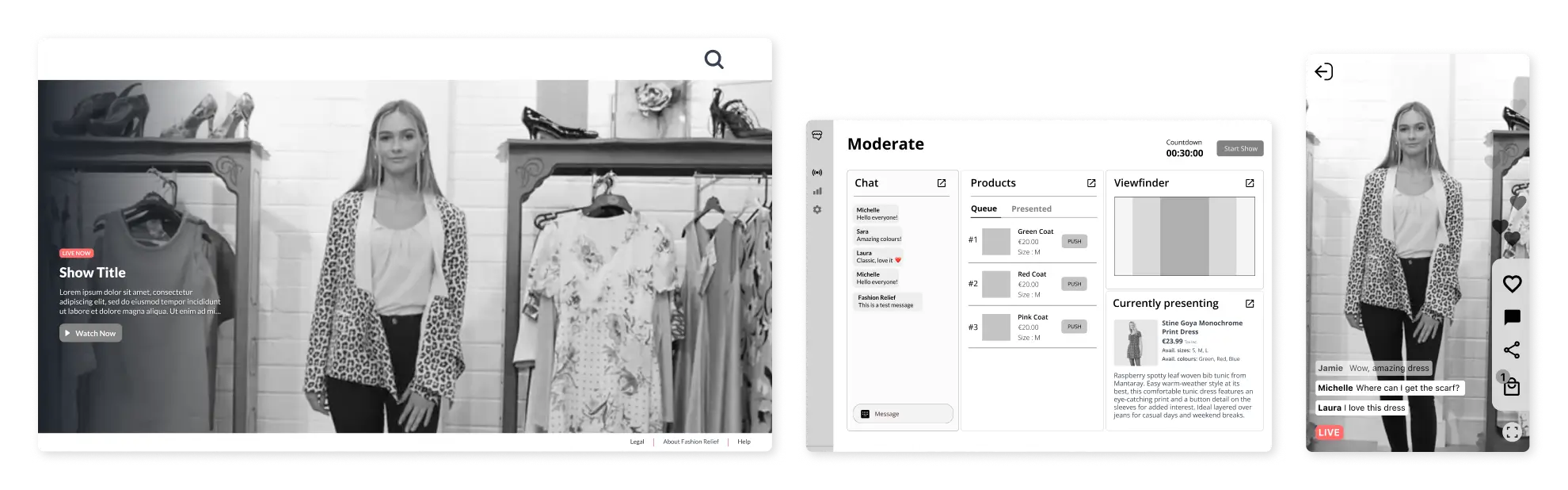
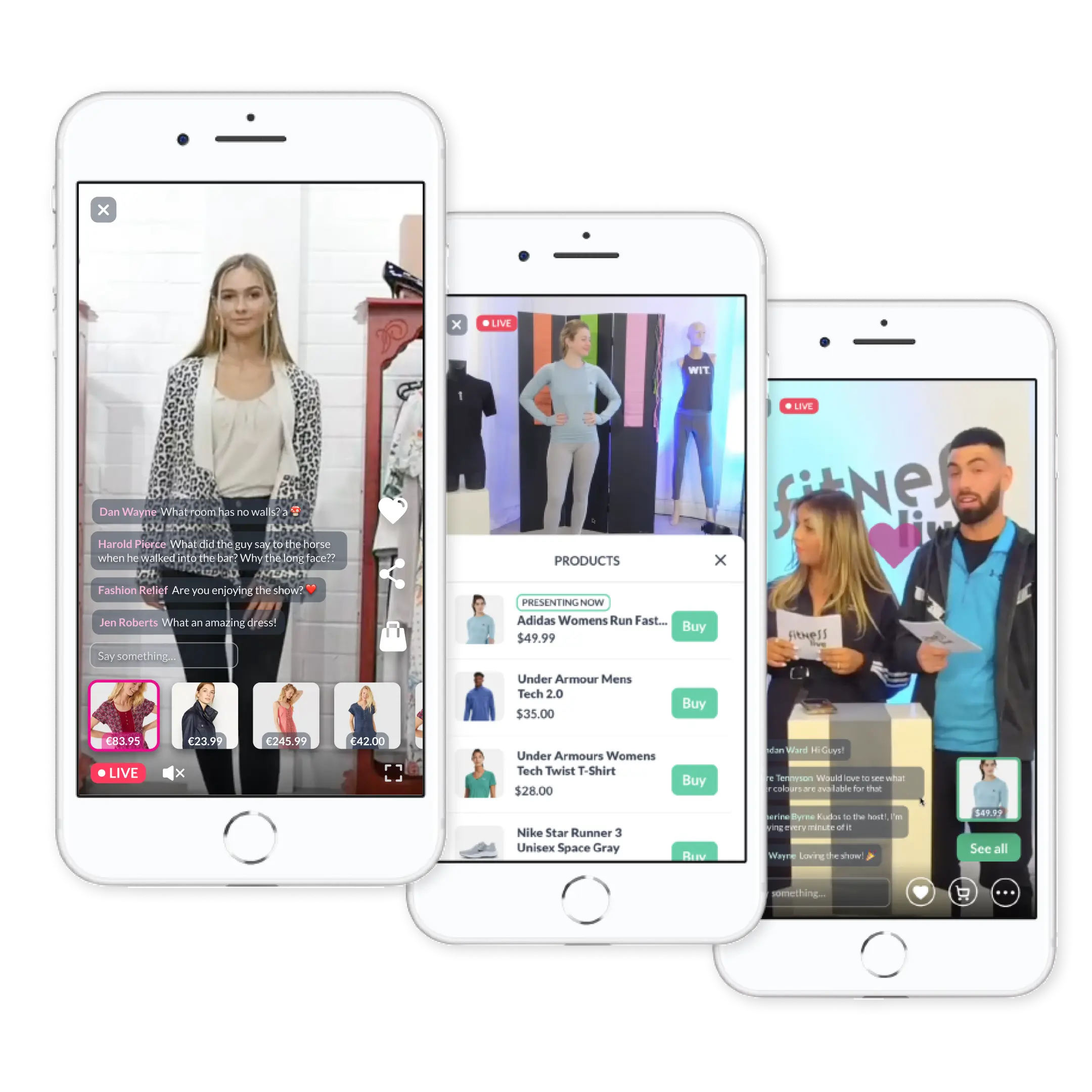
Player
During a live show, users can buy current and past products, chat, share, and send hearts to the host.
The layout keeps the show front and centre, while keeping commerce just one tap away. A product list is always accessible, with tags for promotions and sold-out items, so users never have to choose between watching and shopping.
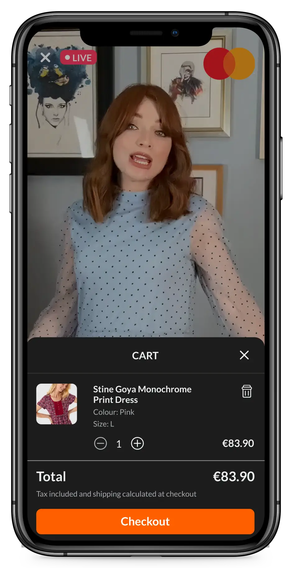
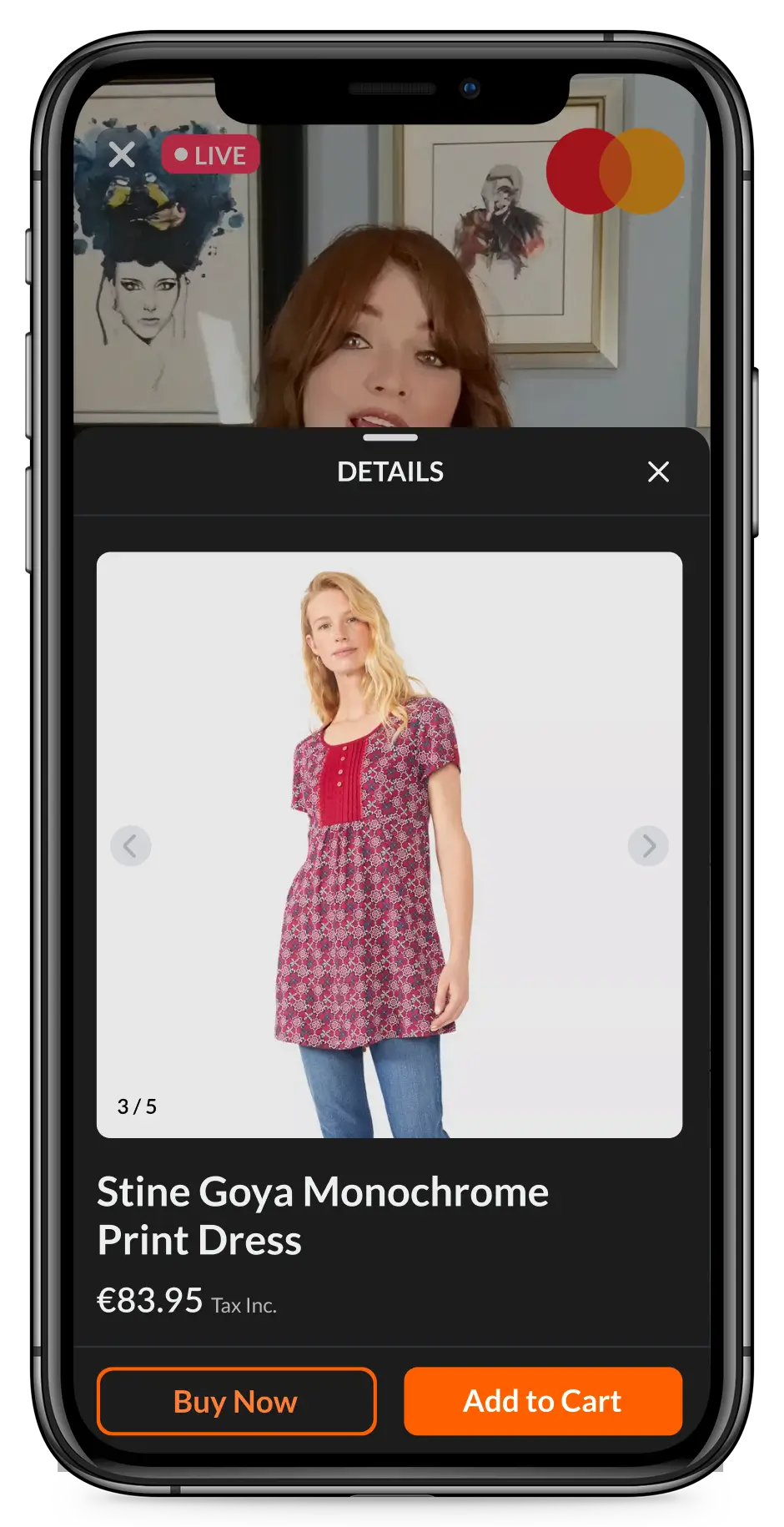
PDP and Cart
The product panel opens at two-thirds of the screen, enough to get a first glimpse of the product, browse images and check the price without leaving the show.
Swiping up takes it full screen, where users get the full PDP: colour and size selectors, product description, size chart, and related products.
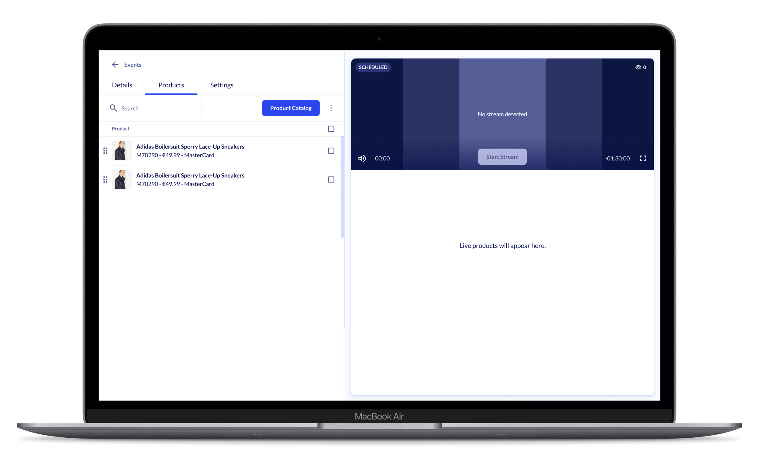
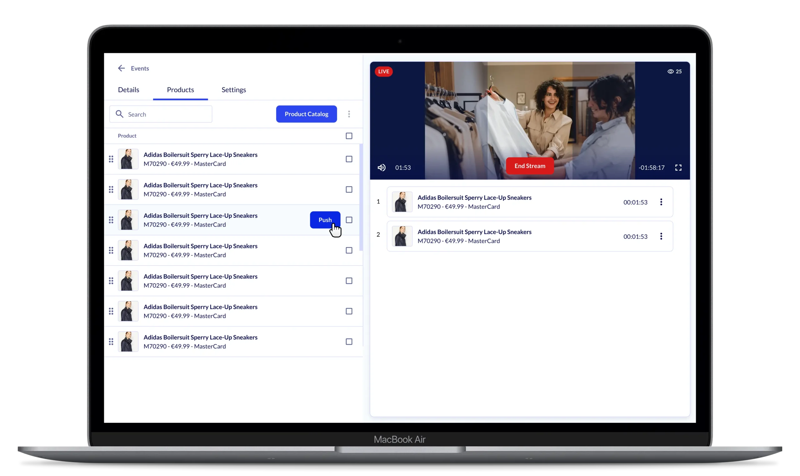
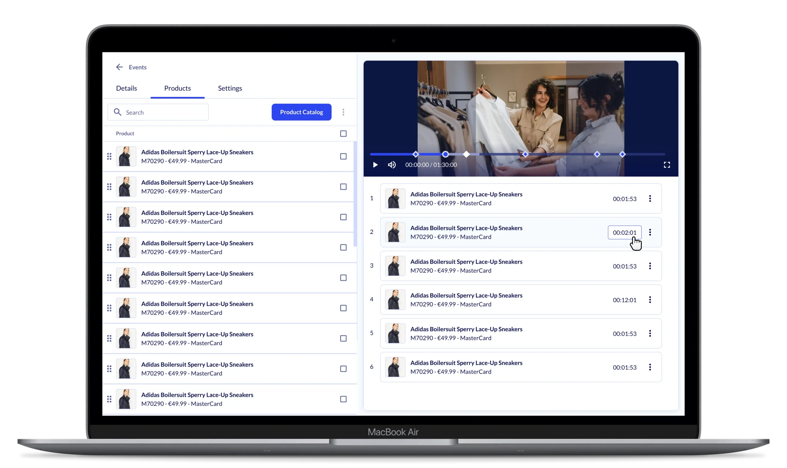
Producer
The producer tool was designed to address the friction points uncovered in the customer journey, while matching the efficiency of existing competitor tools.
Before a show, the curator pulls in products from their Shopify catalogue, configures settings, and goes live. During the show, they can push individual products to the viewer in sync with what the host is presenting. Afterwards, timestamps can be refined or updated to reflect any last-minute changes.
Live Demo Presentation
In January 2022, we ran a live demo for Mastercard showing the full system end-to-end, from entering a show to selecting a product and checking out, using mock purchases with a sports gear scenario.
The desktop UI was still on a pre-testing version, but it was enough to prove the technical foundation was solid and the core flow held up.
Impact
Learnings
Market timing was the biggest risk we didn’t fully account for. Even with strong Chinese precedents and early-mover competitors in the West, livestream commerce adoption in Europe and the US was far slower than our initial discovery suggested. That gap ultimately decided the product’s fate.
For MVP, workarounds beat waiting. Designing a full producer app was the right long-term call, but our existing CMS (but way more complex) was enough to get the consumer side live without delays. Shipping velocity mattered more than polish at that stage.
Chat moderation was underestimated. Building a real-time comment filtering and moderation system turned out to be significantly more complex than scoped. After a technical review, we cut it from the producer release. A business trade-off that made sense, even if it hurt the product’s value proposition.
Some expected PDP features didn’t make it in. User reviews and per-variant stock levels were left out of early iterations due to technical constraints, a gap users would likely notice at scale.